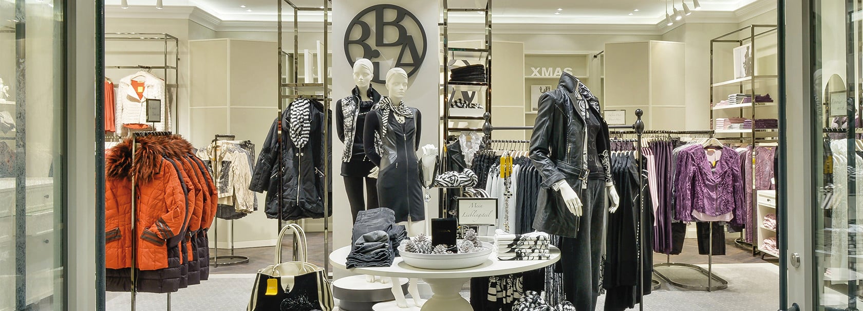
Sophisticated, feminine and high-quality - For its fiftieth anniversary year, fashion brand BiBA presents its customers and itself with a new brand orientation. This includes a new corporate identity, corporate design and store concept, providing a new direction for BiBA, an internationally significant brand. Here customer desires are met with empathetic service in a personal atmosphere. Accordingly, much attention has been paid to details, from the selection of fashions to the shop design. BiBA’s rebranding demonstrates the close, interdisciplinary nature of the teamwork between dan pearlman specialized teams.

BiBA outlets are now part of this special lifestyle. Here, specially designed, white lacquer furniture and room-dividers share space with crown moulding and oak parquet flooring, producing the flair of a French boutique. Brighter and leaner, the newly designed logo has the look and feel of a medallion. Both it and the product displays have a cast-iron appearance. As the primary signet, it graces not only BiBA stores but also all outgoing communication and advertising media that represent the brand. The BiBA boutique – a destination where confidently stylish fashions and current trends come together. BiBA’s rebranding demonstrates the close, interdisciplinary nature of the teamwork between dan pearlman’s units. Here, strategists were responsible for developing the brand identity, including the brand story and brand vision. The retail unit designed the overall concept for the approximately 360 stores worldwide, while the visual communication team was responsible for the redesign of text-based and visual logos and communications media.