Swissness made by Mammut: In 1862, Kaspar Tanner founded the Swiss mountain and outdoor brand Mammut. More than 150 years later, Mammut is one of the best-known companies in the outdoor sector and stands for a high level of expertise that places the highest value on the quality and functionality of its alpine, outdoor and winter sports products. With its long tradition, innovative materials, high-quality workmanship and sophisticated design, Mammut has embodied the term “swissness” for decades. Together with the retail experts from dan pearlman brand architecture, this Swiss alpine world was translated into a contemporary zeitgeist and captured in a new corporate design. In the new store at Zurich Airport, there are approx. 53 square meters of everything you could have forgotten for the sportive holidays and much more.
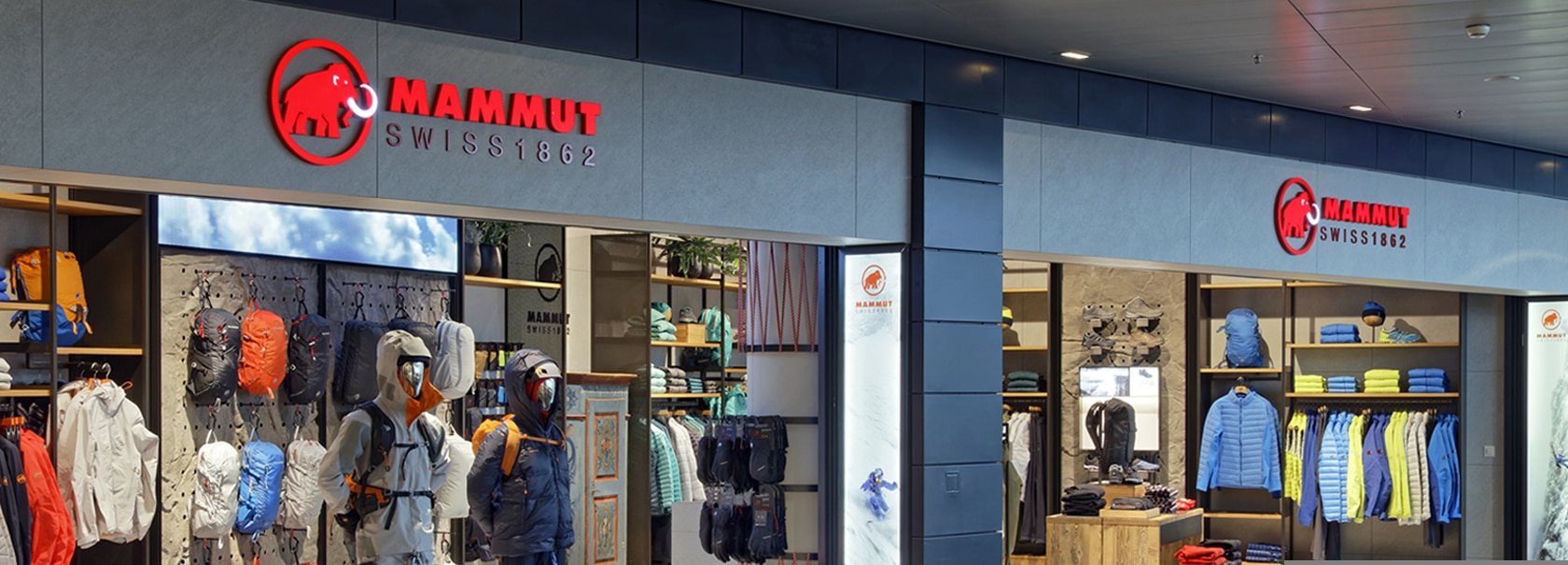

In order to modernize the appearance of the traditional brand Mammut, the corporate design was revised by the dan pearlman brand architects and adapted to the new store concept “contemporary alpine”. This new brand identity will be reflected in all future communication tools, which have been redesigned accordingly.
The mammoth as a trademark is the connecting design element across all media. The slight retouch of the iconic logo creates a fresh appearance for the brand. In addition, the font has also been adapted to the new, clearer look. Now, the colors white and red are dominating and represent the typical Mammut appearance. With the white component being the predominant one, an open and fresh feeling is created in the new store. In order to ensure a consistent brand appearance in the long term, color harmony and image composition were defined. Pure landscape pictures are desaturated and processed with more contrast. For motifs with persons, the colorfulness in the surroundings and in the background is reduced, while the color on the clothing and on the person is maintaining. So-called Active Arrows, which are composed of individual parts of the Swiss cross, are used as a new design element. By placing them at the bottom left and top right of a graphic, one can create a dynamic composition. Action shots of various mountain sports in the entrance and exit areas awaken the customer’s desire for fresh mountain air. Brown uncoated paper stands for the packaging responsibility of Mammut. The new brand identity therefore extends to the choice of shopping bags. The carrying handle consists of a recyclable rope cord from Mammut’s own assortment. In order to create a lively and contemporary atmosphere within the store, modern components such as a three-meter-wide LED screen were integrated. It portrays a virtual window with blue skies and passing clouds which makes customers wish to be in nature as soon as possible. The screen was installed by the Swiss specialists for advertising technology and temporary architecture Richnerstutz. In addition to that, the furniture was adapted to the new brand identity down to the smallest detail – climbing accessories such as ropes and carabiner hooks underline the natural character of the brand and have been integrated into the functional components of the store. At the same time, the product carriers and back walls of the new store are deliberately designed in a restrained manner, so that the colors of the Mammut products prominently catch the costumer’s eye. The centerpiece of the shop area is the prominent Appenzeller cupboard behind the cash register, which, alongside elements such as the History Wall, embodies the brand’s long-standing tradition.