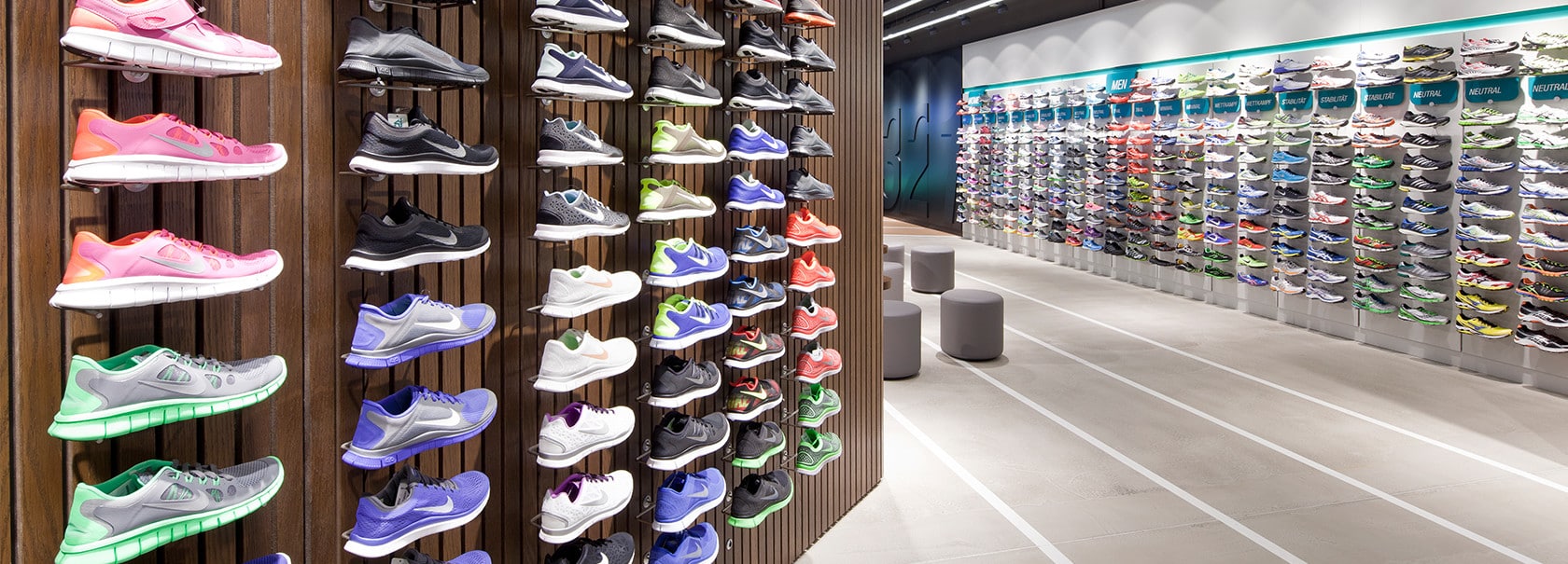
Passionate employees who prefer spending their free time running, a diverse assortment of products ranging from shoes to the right training outfits and even energy food for athletes have made up the RUNNERS POINT portfolio since its launch in 1984. Well-stretched and highly motivated to set a best time, the interior designers, designers, graphic designers and copywriters at dan pearlman set about creating for RUNNERS POINT a completely new brand world. The 550 square metre innovative shop concept was designed around the ‘world of running’ theme, a dan pearlman-designed flagship store convey the brand’s passion for its sporty customer base. The largest selection of athletic shoes in Europe was embedded within a world of athletic experience featuring a centrally placed track for analysing runners as well as a fifteen-meter long video wall to the side.

The running data is evaluated at the Sportlab and customers are fitted with the running shoes that are best for them. After so much sporting activity, one can lean back in the Running Lounge and read up on RUNNERS POINT articles online on the permanently installed iPads. The shop is divided into distinct brand sections that create separate zones and facilitate orientation, producing an eye-catching visual impression. In addition to the interior design details which connect better with customers, the logo and the overall visual communications have also been redesigned in a way that injects more dynamic energy into the brand and wins over customers in a sprint instead of a 1000-metre run. The logo and the overall visual communications have also been redesigned in a way that injects more dynamic energy into the brand and wins over customers in a sprint instead of a 1000-metre run. By combining these elements a holistic destination emerges.