Reliability without restrictions – the men’s fashion brand Babista sets new brand goals. With its corporate identity relaunch, the label also addresses younger target groups. The new brand appearance connects fresh inspiration with existing brand values. The well-structured design pushes the established comfort of the brand in the center of attraction and positions the personal customer approach at the forefront. For the relaunch, all relevant communication channels of the brand have been considered and integrated in the new design. As the leading medium, the Babista catalogue plays a significant role and was reinterpreted with great love for detail. Under the direction of senior art director Thomas Rudolph, dan pearlman Markenarchitektur, a design concept arouse that wraps the new guiding principles of Babista in a holistic visual story.
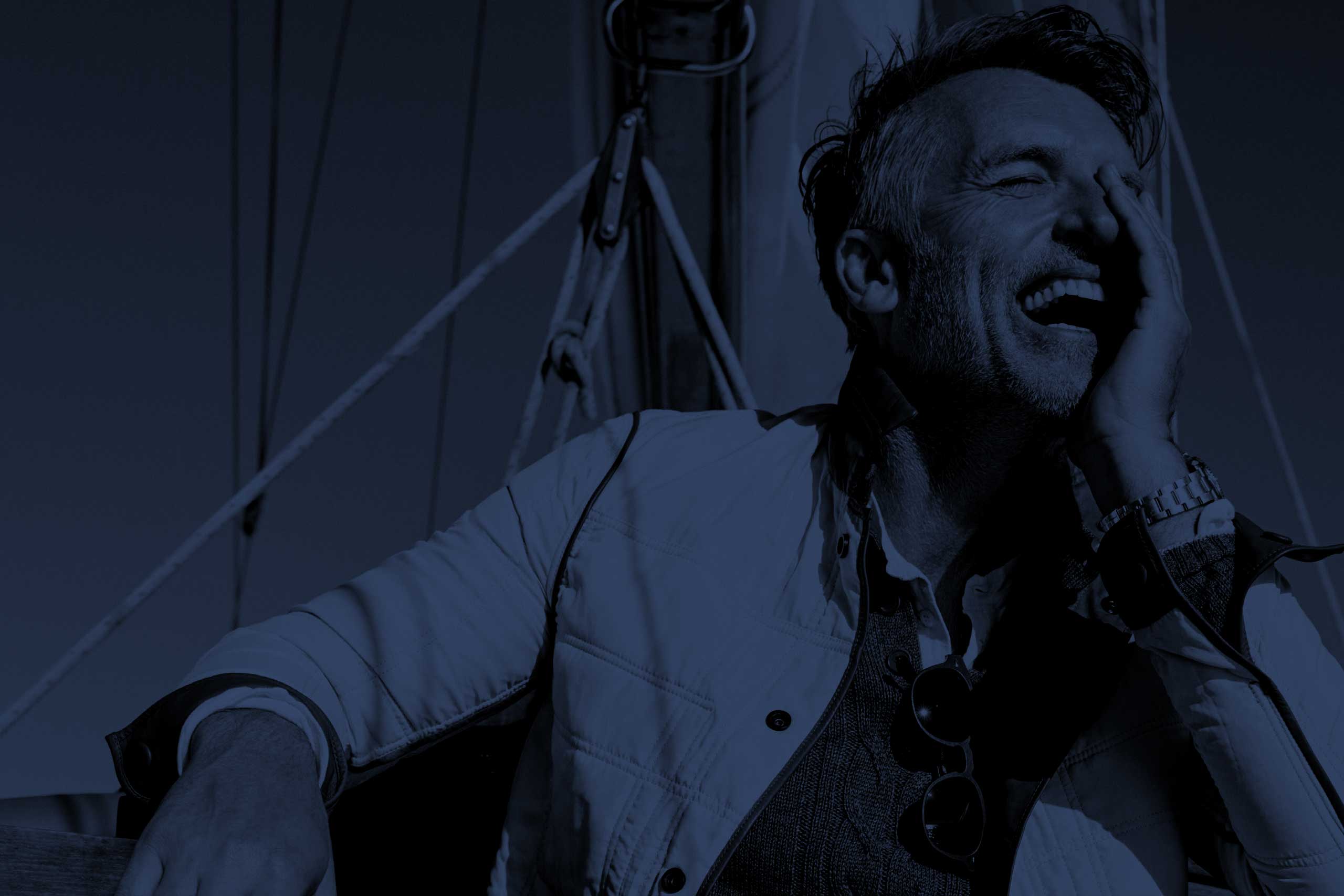

As part of the KLiNGEL-GRUPPE, men’s fashion brand Babista represents personality, comfort and excellent customer service. It especially addresses the core target group of over 60-year olds. The repositioning of the brand aims to extend the target group and wants to equally address younger men. Therefore, dan pearlman developed a holistic design concept built on a clear structure and including all communication tools. For the new clarity of the brand, the supersign of the logo was redesigned and replaced by a linear and graceful trademark. The font, as well, was aligned with the lucid new look. Babista sticks to its remarkable blue as brand color to maintain recognizability. Moreover, special attention was given to the redesign of the catalogue concept as the main sales channel. The goal was to create a spirit for the entire fashion catalogue: Babista is reliable, no matter how old you are. Therefore, the new and clear style rather reminds of a fashion magazine than the classic order-catalogue, offering perfect overview over the range of products while leaving enough open space for inspiration. Concurrently, the thought-through catalogue structure along the collections underlines the different situations in men’s life where Babista accompanies them. To guarantee a consistent long-term brand performance, the style of photography, harmony of color and image composition have undergone a holistic analysis for the perfect design. By using full page pictures that tell everyday life stories of the confidently stylish man, not only the reliability of the products is placed in the foreground, but customers are also offered inspiration for outfit looks and product combinations. Detail and portrait shots are depicting the highlights of the collection and product quality. In addition, the product copy texts are supporting the storytelling line of the catalogue by using a tonality with high recognition value that underlines the depicted sense of life. Like so, image composition, color patterns and description texts impart the new corporate identity. Altogether, those elements guide the customers through the range of Babista products by telling an emotional and inspiring story. To provide a special highlight, the backcover was also integrated in the new concept. Because this part is intended to integrate the postal code, a plain white design was chosen. This opens up for the possibility of underscoring gift options, small product lines or entire looks. The new corporate identity creates a fresh and clear brand story and addresses men in different age groups. To develop a holistic brand experience for existing and potential customers, the new concept was simultaneously transferred to sales equipment and details like hang tags of the fashion items.