How is it possible to explain the Emir of Qatar and its advisors, the results of an eight-month study for a transport system of the future in just sixty minutes? For the German lead agency Atkon dan pearlman developed the brand world “Qatar Railways” in the desert of Qatar in a 1,300 square meter production space. Within three months proposals for a corporate identity and design concept, including ideas for the branding of trains and uniforms for service personnel werde developed. dan pearlman gratefully accepted several awards such as the EVA Award 2011 in Silver, the iF Communication Design Award 2011, the EVA Gold Event Award 2009 and the nomination for the German Design Award 2011.
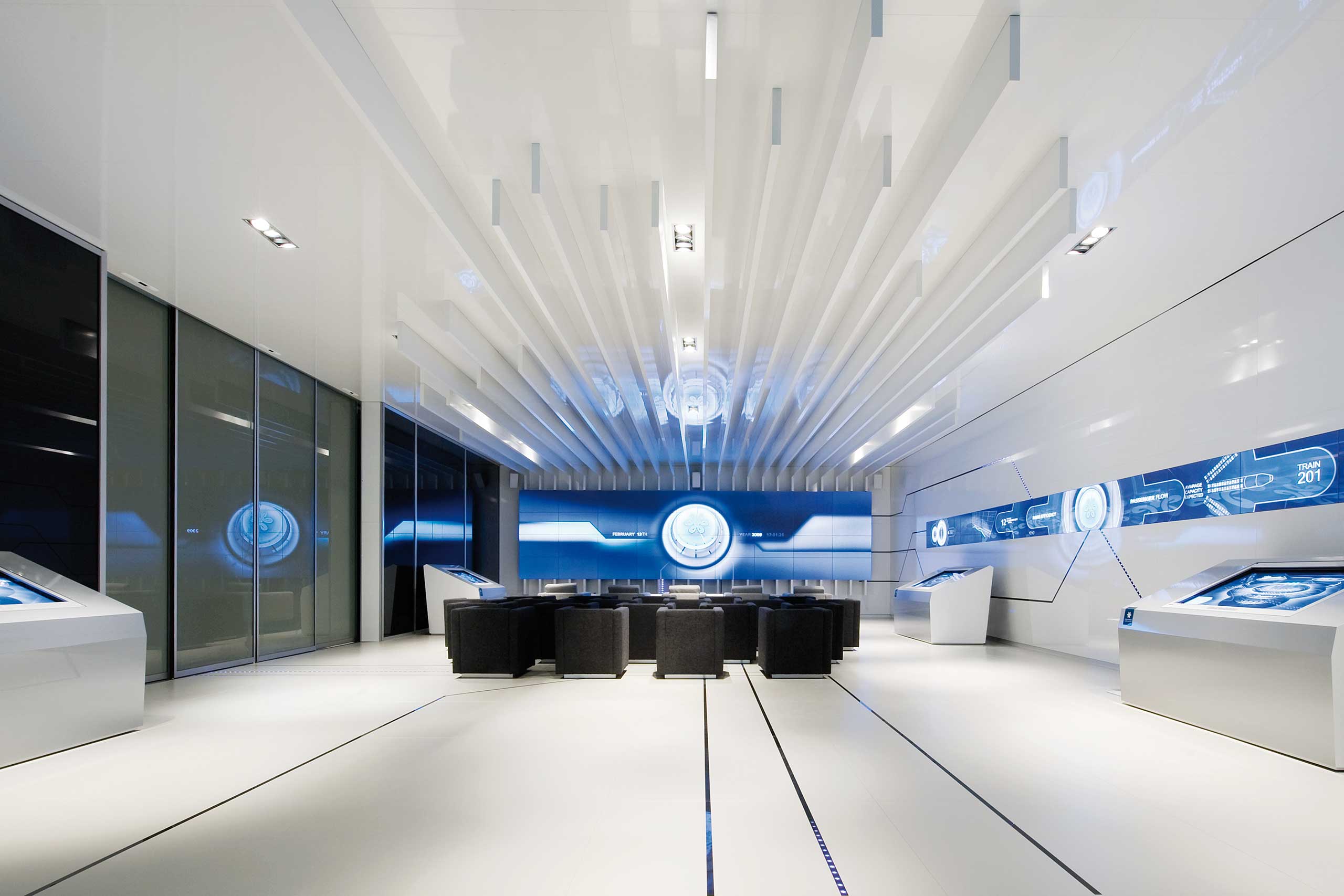
A tunnel of visual media opens the door to the future. In this virtual world of the rail station a tour within seven different phases is supposed to reconstruct the dynamic of the transport system. Through interaction and with the help of various designs it makes it easier and more exiting to understand the complex details of the transport studies, at once. The circling logo represents joined-up service and dynamism, the basic blue colour precision and reliability. The detailed corporate design covers every area, from the branding of the trains an design of the lounges right down to staff uniforms. This ensures continuous brand communication.